Pretty…simple…
Since I’m in the business of branding, I thought I should bring up the new look and logo that Serena & Lily just launched. According to the well-known nursery brand, they decided to revamp their identity to appeal to a broader audience now that they’ve expanded their line to other rooms of the house.


I love the new quail icon and monogram! Classic, fresh, and pretty.
And I think they’ve done a great job of integrating the new brand into their major materials…
WEBSITE:


CATALOG:


Here’s the BUT for me….while I totally agree with sprucing up/changing up your brand every few years to keep it fresh and relevant, I’m not one that would encourage a total logo redesign when your company already has a major following based on that logo. I wonder if they instead could have kept the font from their original logo, removed the swirls, and changed the color to that gray-blue? Would it have still worked, you think?
Brings up my point: put the thought and the investment up front into an enduring logo that is versatile! Yes, think 10-20 years down the road! I come across a lot of biz owners that think they need to say everything about their company in their logo. But often, simpler really is better. Build around it with elements you CAN change without compromising your foundation.
There is also a part of me that feels like they’ve simplified the surrounding elements a little TOO much, perhaps. Do they sort of look like a lot of other companies out there now, i.e. have they lost their niche? (I realize I’m overthinking it, but this is the kind of stuff that keeps me up at night!)
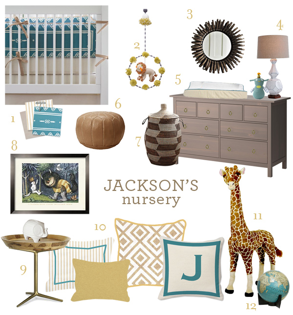
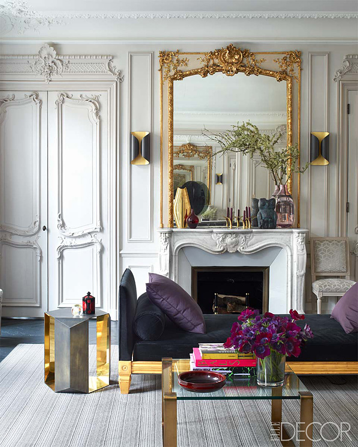
With all of this in mind, I wanted to pull a few of my favorite images for one last, closer look. My hope is that they take the brand further into the direction of these beautifully shot lifestyle images…


Money shots, right?


Hmmm…good point. It is like they wanted it to grow up? More tailored and maybe serious….I really only associated them with nursery things hence the rather “scrolly” look for their logo.
Definitely this was the intention. It reminds me of Kelly Wearstler’s fashion line. She kinda played it safe, like she wasn’t quite comfortable yet in new territory.
I liked their old logo better. I think it was broad/general enough to continue to represent them into other ventures. But now that they’ve switched, it’s the bird that has me bothered. The bird needs to be everywhere (everywhere possible) or nowhere. Don’t put it on your tags if you’re not going to put it on your web header and catalog, etc. If anything, I would have softened the swirls on the old logo a little bit and left it at that.
Feeling the same about the old logo and I think the new is kinda bland. But I don’t have a problem with an individual icon or “mascot” that they can use separately from the logotype. It’s a little more flexible for them — although I see what you mean about its importance!
Since I did not know of them before, I like the “new”, especially the S&L. Thank you Erika for opening my eyes, and pocketbook!
Loving the Nomad bike shot!
Ha ha, I know they are pricey! And yes that bike shot is right up your alley!
I agree with what Jill said about the bird in the new logo…its on the tags but I do not see it on the site? Hmm…I do like the logo though but agree with you that they could have incorporated the old logo by just removing the swirls and changing the color. I think that would have still worked ! I do love all their new home things !
xxLily
goldandgray.com
i liked their old look but I LOVE the new look!
PS. new follower!
Welcome Cara!!!
You raise several really interesting, and contentious, points. I don’t know the brand, so I guess that colours my take on the change, but would it be a fair guess that when they started out they didn’t expect to become so big, so not much thought (or money) was put into the original logo? Which I guess is one of your points ~ if you are going to do something, do it properly in the first place or not at all.
And then, if one is going to change, should there be a connection or not with the original? Well, I think in this case, because they were changing the product, a totally new look works, with the only link being the name. But that little bird should be everywhere, or nowhere!
And I also agree with your comment about the lifestyle shots ~ they are “wow factor” pieces which have instant emotional pull. And if this represents a toe in the water, it would be good if they jump in completely with this look!
– on a side note, I love the little girl and the dog in the blue bedroom. Something about it that just works.
Love their new look and the new catalog…amazing pieces!!
THANK YOU everyone for your very thoughtful comments! Obviously this topic interests me a ton, and I really do like to hear what others think about it, especially those that would be considered a target audience.
And did you see the bit about it in the new Lonny? I chuckled!
You’re always making me use my brain! Love your thought-provoking posts.
I just got their new catalogue in the mail. So well done! I want one of everything. So fresh!
Do you the name of the decorative script font used in some titles in Serena and Lily catologs. I want it!